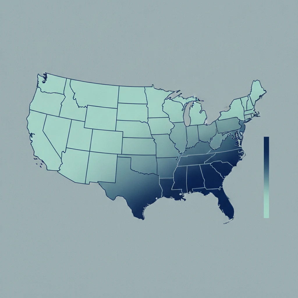
A Maryland hospital bills a median of $28,595 for a knee replacement. A Nevada hospital bills $120,428 for the same operation. That is more than four times as much — and it is not because Nevada is an expensive place to live. By the government's own price index, Nevada is below the national average for cost of living, while Maryland sits above it. If local prices drove hospital charges, the numbers would run the other way.
We ran the comparison across eight major surgeries and every US hospital in Medicare's payment records — the same federal dataset that powers the hospital-price maps on our procedure pages. The pattern holds procedure after procedure: what a hospital bills for surgery tracks the rules of the state it sits in, not the price of a house or a gallon of milk nearby. One state has figured out how to keep the sticker honest. Most haven't.
One number to keep straight before we go further. Everything below is the billed charge — the hospital's chargemaster sticker. It is not what an insured patient pays after their plan negotiates it down. But it is exactly what an uninsured or out-of-network patient is charged first, and it's the anchor every negotiation and every surprise bill starts from. So the sticker is worth understanding even when you never pay it in full.
The 9-to-1 spread hiding in plain sight
To compare states fairly, we can't just look at raw dollars — a state that happens to do more complex cases would look expensive for the wrong reason. So we measure each state's markup: the hospital's billed charge divided by what Medicare actually pays the facility for that same case. Because Medicare's payment already accounts for how sick the patient is and how the procedure is done, the markup strips most of that out and leaves the part that's really about pricing behavior.
Averaged across all eight surgeries, the gap between states is enormous — and it lines up backwards against cost of living:
| State | Billed-to-Medicare markup | Cost-of-living index* |
|---|---|---|
| Maryland | 1.2× | 105 (above average) |
| Massachusetts | 2.8× | 110 (high) |
| Minnesota | 4.4× | 98 |
| Connecticut | 4.6× | 103 (above average) |
| Arkansas | 4.9× | 87 (low) |
| South Carolina | 7.7× | 92 (low) |
| Arizona | 7.9× | 102 |
| Texas | 8.4× | 98 |
| Florida | 10.8× | 102 |
| Nevada | 11.3× | 96 (below average) |
*Cost-of-living figures are the Bureau of Economic Analysis Regional Price Parities (US average = 100). BEA, Regional Price Parities by State
Read the two columns together. The cheapest-billing states include Maryland and Massachusetts — two of the pricier states in the country to actually live in. The most expensive-billing states are Nevada, Florida, and Texas, all at or below the national cost-of-living line. The state where a hospital marks a surgery up eleven-fold is a cheaper place to live than the state where it marks it up barely at all.
We tested the cost-of-living theory. It failed.
"Everything just costs more in some states" is the intuitive explanation, so we checked it directly instead of hand-waving it away. We correlated each state's average surgical markup against the BEA's cost-of-living index across the 36 states with enough hospital data to be reliable.
The correlation is essentially zero — slightly negative, in fact (a coefficient of about −0.10). In plain terms: a state's cost of living explains only about 1% of the difference in what its hospitals bill for surgery. Knowing whether a state is expensive to live in tells you almost nothing about whether its hospitals bill aggressively.
It isn't a perfectly clean inverse, and it would be dishonest to pretend otherwise: California is both expensive to live in and a high-markup state, and New Jersey lands in the middle on both. The point isn't that cheap states are always dear and dear states always cheap. It's that the cost-of-living lens has essentially no predictive power here. Something else is doing the work.
What actually moves the number
Two forces explain far more than local prices do, and one of them shows up as an almost perfect natural experiment.
1. Whether the state regulates hospital rates. Look back at that markup table and one number is jarring: Maryland, at 1.2×, bills almost exactly what Medicare pays. Every other state runs several times higher. That's not luck. Maryland is the only state in the country that sets hospital rates for all payers through an independent commission — the Health Services Cost Review Commission — so a hospital there can't maintain a fantasy chargemaster that runs many times its real payments. Its sticker is roughly its price. The system has operated since the 1970s and, as of January 2026, runs under the federal AHEAD model that carries the global-budget approach forward. Maryland HSCRC No other state charges every payer the same regulated rate — which is precisely why no other state's markup comes anywhere close to 1.2×.
Maryland isn't evidence that regulation lowers costs in some grand sense — its low markup is partly the mechanical result of tying charges to payments. But that's the point of showing it: it's the one place where the chargemaster game simply isn't played, and it demonstrates how much of the "sticker" everywhere else is discretionary rather than driven by the cost of doing business locally.
2. Who owns the hospitals, and how much competition they face. For the other 49 states, health economists have long tied extreme chargemaster markups to for-profit ownership and concentrated hospital markets far more than to input costs. The landmark study on this — Bai and Anderson's Extreme Markup analysis of the fifty highest-markup US hospitals — found that 49 of the 50 were for-profit, and that Florida alone held 20 of them. Bai & Anderson, Health Affairs (2015) The high-markup states in our table — Florida, Nevada, Texas, Arizona — are exactly the ones where for-profit chains hold large market share. We're not claiming to have measured ownership hospital-by-hospital; we're pointing out that the states topping our markup list are the same ones this literature already flagged, and cost of living isn't on that list.
"But I have insurance — why should I care?"
This is the fair objection, and it deserves a real answer, because it's true that an insured patient rarely pays the chargemaster sticker. The billed number still reaches into your wallet in four ways:
- Out-of-network and surprise bills. When a provider is out of your network, your balance is calculated off the billed charge — so a state where hospitals bill 11× isn't just a number on paper if one of your providers falls outside the network.
- Percentage-of-charge contracts. Some insurers pay hospitals a percentage of billed charges, so an inflated chargemaster pulls the negotiated price up with it — which flows back to you as premiums and coinsurance.
- The uninsured and self-pay. If you don't have coverage, or you're paying cash for an elective procedure, the sticker is your opening bill, not a hypothetical.
- The negotiation anchor. Every cash quote and every appeal starts from the charge. Knowing a Nevada hospital's $120,000 knee sticker sits on top of a ~$13,000 Medicare payment tells you exactly how much air is in the number.
We walk through that last point in depth in what Medicare actually pays vs. what hospitals bill, and the mechanics of the sticker itself in what a hospital chargemaster is.
The dollars behind the ratios
Ratios can feel abstract, so here are three of the eight procedures in real median billed dollars — Maryland against Nevada against the national middle:
| Procedure | Maryland (billed) | Nevada (billed) | US median |
|---|---|---|---|
| Knee replacement | $28,595 | $120,428 | $62,731 |
| Gallbladder removal | $21,493 | $188,442 | $76,663 |
| Heart bypass | $65,725 | $531,591 | $218,498 |
A caveat that keeps you honest about the extremes. Nevada is a small state with few reporting hospitals — the gallbladder and heart-bypass figures above rest on fewer than ten facilities each, so treat the exact dollar amount as a wide estimate, not a precise quote. That thin-sample warning is exactly why we lead with the eight-procedure average markup rather than any single headline number: the state-level pattern is robust even where one procedure's sample is small. Where a state's hospital count is low, our procedure pages flag it directly.
What to do with this
You can't move states for a surgery, but the geography still changes how you should read an estimate:
If you're in a high-markup state and the procedure is planned rather than emergent, the gap between the sticker and the real price is at its widest — which means a cash quote or a Good Faith Estimate has the most room to negotiate down. In a low-markup state, the billed number is already close to what the operation is paid, so there's less air to squeeze out. Either way, the move is the same one we lay out in the cash-pay negotiation playbook: never treat the first billed figure as the price. And because two hospitals in the same city can bill wildly different numbers for the identical operation, the state pattern is a starting point, not the last word — always check the specific hospital.
The durable takeaway is small: before you react to a surgery estimate, ask what state logic produced it. A five-figure difference between two hospitals doing the same operation usually isn't about the cost of anything. It's about the rules — and in 49 states, those rules leave the sticker almost entirely up to the hospital.
How we built this
Figures come from CMS Medicare Provider Utilization and Payment data (release year 2023), aggregated across every reporting hospital for eight procedures: knee replacement, hip replacement, heart bypass, open-heart surgery, gallbladder removal, hernia repair, cataract surgery, and pacemaker implant — the same source that renders the hospital-price tables on our procedure pages. "Billed" is the hospital's covered (chargemaster) charge; "markup" is billed divided by Medicare's facility payment. Because Medicare pays by diagnosis-related group and outpatient classification — not by CPT code — this is a hospital-price comparison, not a line-item audit of any one bill. State medians rest on the hospitals in that state that reported each procedure; where fewer than five did, the figure is unreliable and flagged as such. Cost-of-living comparisons use BEA Regional Price Parities (2022).
Frequently asked questions
Which state has the cheapest surgery prices?
By hospital billed charges, Maryland is consistently the lowest — a direct result of its all-payer rate-setting system, which is unique in the US. Massachusetts is second. But "cheapest billed" mainly benefits the uninsured, self-pay, and out-of-network; for a fully-insured patient, the negotiated rate matters more than the sticker.
Does a lower cost of living mean cheaper surgery?
No. Across 36 states with reliable data, a state's cost of living has almost no relationship to what its hospitals bill for surgery — the statistical correlation is roughly zero. Some low-cost-of-living states (Nevada, Georgia) are among the most expensive for surgical billing.
Why is Maryland so much cheaper than everywhere else?
Maryland is the only state that regulates hospital rates for all payers through an independent commission. Because hospitals there can't set an inflated chargemaster, their billed charge is close to what they're actually paid — about 1.2 times Medicare, versus 5 to 11 times in other states.
Do these state differences apply to cosmetic or dental surgery?
No. Cosmetic and most dental procedures aren't covered by Medicare, so there's no federal payment benchmark to measure markup against. Their prices are set entirely by the local market and quoted as self-pay list prices instead.